UX That Converts: Designing Websites Your Customers Will Love
UX That Converts: Designing Websites Your Customers Will Love
Imagine wandering into a shop so cluttered and confusing that you leave empty-handed and grumbling about the experience. That’s precisely what a poor website feels like in the digital realm.
UX That Converts: Designing Websites Your Customers Will Love
Imagine wandering into a shop so cluttered and confusing that you leave empty-handed and grumbling about the experience. That’s precisely what a poor website feels like in the digital realm.
In contrast, a site with intuitive navigation, striking visuals, and a frictionless checkout process is like entering a five-star store where every staff member knows your name and anticipates your needs. That’s the power of user experience (UX) that converts––designing websites your customers not only enjoy but can’t resist engaging with and buying from.
In today’s ultra-competitive online environment, a pretty façade is no longer enough. You need a UX strategy grounded in real human behaviour, data-driven insights, and continuous refinement. Over the next few(ish) words, we’ll explore how to craft conversion-focused websites that blend empathy, psychology, and technical prowess. Buckle up: it’s time to turn casual visitors into loyal advocates.
1. Start with Empathy: Know Your Users Inside Out
Great UX begins not with pixel-perfect wireframes but with a deep understanding of your customers. What keeps them up at night? What are their goals, frustrations, and motivations when they visit your site?
User Personas: Create detailed personas that capture demographics, behaviours, pain points, and objectives. A tech professional in their 30s with limited spare time will interact differently than a retiree exploring hobbies online.
Empathy Interviews: Talk to real users—conduct interviews or usability tests to hear their language and observe their habits. Their direct feedback reveals hidden roadblocks that analytics alone can’t capture.
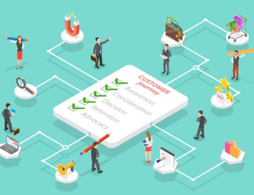
User Journey Mapping: Chart every step a customer takes from discovery to purchase (and beyond), noting emotional highs and lows. These maps highlight crucial touchpoints where you can exceed expectations or risk losing them entirely.
By designing with empathy, you ensure your site resonates on a human level, creating the emotional connection that drives conversions.
2. Clear Information Architecture: Simplify, Don’t Stumble
A website overloaded with menu items, buried submenus, or ambiguous labels is a conversion killer. Your information architecture (IA) should be as straightforward as a well-organised filing cabinet:
Card Sorting Exercises: Ask users to group content into logical categories. This reveals their mental models and ensures your navigation aligns with their expectations.
Flat Navigation Structure: Limit top-level menu items to five or six. Overly deep hierarchies force users to click too much, increasing frustration.
Descriptive Labels: Use clear, action-oriented labels—“Shop Women’s Running Shoes” is more intuitive than “Products.” Avoid industry jargon that confuses newcomers.
When users find what they need in two or three clicks, they feel in control, boosting satisfaction and the likelihood of conversion.
3. Design for Speed: Performance Equals Patience
Every second counts. Research shows that a single extra second of load time can reduce conversions by 7%. If your site drags its heels, visitors will bail faster than you can say “404 Error.”
Optimise Assets: Compress images, lazy-load below-the-fold content, and leverage modern formats such as WebP.
Minify Code: Remove unnecessary characters, comments, and whitespace in your CSS, JavaScript, and HTML.
Use a CDN: Distribute content from servers closest to your users, slashing latency.
Reduce Plugins: Each third-party plugin adds weight. Audit and remove any that aren’t mission-critical.
A lightning-fast site not only delights users but also earns brownie points from Google—and higher rankings mean more traffic to convert.
4. Mobile-First Mindset: Because Everyone’s on the Move
With over half of web traffic on smartphones, designing desktop-centric sites is a recipe for disaster. A mobile-first approach ensures your UX adapts gracefully to small screens:
Responsive Layouts: Use flexible grids and media queries to reflow content seamlessly.
Thumb-Friendly Interactions: Position primary CTAs within thumb reach (the “thumb zone”) and make buttons at least 44x44px.
Content Prioritisation: On mobile, less is more. Condense menus, collapse secondary content, and foreground the elements that drive action.
Test on Real Devices: Emulators only go so far. Test on actual smartphones and tablets to uncover quirks and friction points.
Mobile optimised experiences convert up to 64% better, simply because they respect users’ contexts.
5. Visual Hierarchy and Readability: Guide the Eye, Guide the Action
Your layout should tell a story without saying a word. Strategic use of typography, whitespace, and colour guides visitors towards your conversion goals:
Size & Contrast: Headlines should be significantly larger than body text. Use bold or contrasting colours for CTAs to make them pop.
Whitespace: Don’t be afraid of empty space—it gives elements room to breathe and draws attention to key areas.
Scanning Patterns: Follow the F- or Z-pattern layouts, as users typically scan pages in these shapes. Place important content along these lines.
Accessible Fonts: Choose legible typefaces, sufficient line heights (around 1.5), and high contrast (WCAG recommends a ratio of at least 4.5:1 for normal text).
When your visual hierarchy is spot on, even first-time visitors know exactly where to go and what to click.
6. Persuasive Copy and Microcopy: Speak to Their Needs
Great design sets the stage, but words close the deal. Your copy should address pain points, showcase benefits, and include clear, action-oriented language:
Value-Driven Headlines: Lead with the benefit. “Get Your Best Night’s Sleep Ever” trumps “Discover Our Mattress Range.”
Concise Body Copy: Keep paragraphs short and scannable. Use bullet points to highlight features and benefits.
Microcopy Matters: Error messages, form labels, and button text all contribute to UX. Change “Submit” to “Get My Free Ebook” to make CTAs irresistible.
Trust Signals: Pepper in social proof—customer reviews, ratings, and logos of known clients reinforce credibility.
Copy and design should work in tandem: visuals draw users in, words keep them engaged and nudge them toward action.
7. Streamlined Forms and Checkout Flows: Minimise Friction
Nothing derails conversions like a convoluted form or checkout process. Every extra field is a potential drop-off:
Only Ask What’s Necessary: If you don’t need someone’s postal address or company size, don’t request it.
Inline Validation: Provide real-time feedback—highlight errors as users type, not after they hit “Next.”
Progress Indicators: For multi-step forms, show users where they are in the process and how many steps remain.
Guest Checkout Options: For e-commerce, forcing account creation kills conversions. Offer a guest checkout path and move account creation to a follow-up email.
A swift, frustration-free form experience can boost conversions by up to 300%.
8. Accessibility: Design for Everyone
Inclusive design isn’t just ethical—it broadens your audience and reduces legal risk. Accessible sites perform better in search and create goodwill:
Keyboard Navigation: Ensure all interactive elements are reachable by tabbing.
Alt Text & ARIA Labels: Describe images and form controls for screen readers.
Colour Contrast: Adhere to WCAG contrast ratios for text and UI elements.
Readable Fonts & Sizes: Avoid tiny text; aim for at least 16px body font.
An accessible website converts more visitors because it removes barriers for users with disabilities, older adults, and those on low-bandwidth connections.
9. Testing, Analytics, and Iteration: The Conversion Flywheel
Your UX design process doesn’t end at launch. Continuous testing and data analysis are essential:
Heatmaps & Session Recordings: Tools like Hotjar or Crazy Egg reveal where users click, scroll, and get stuck.
A/B & Multivariate Testing: Experiment with button colours, headlines, imagery, and layouts. Let data guide your decisions.
Funnel Analysis: Track drop-off points across your conversion funnel—identify and resolve bottlenecks.
User Feedback Loops: Surveys, chat transcripts, and support tickets surface unanticipated UX pain points.
By iterating based on real user behaviour, you maintain momentum—you don’t just build a great site once; you refine it into an ever-more effective conversion machine.
10. Cultivating a UX-First Culture
Finally, UX that converts isn’t just a designer’s job—it’s an organisational philosophy:
Cross-Functional Collaboration: Bring marketing, development, customer support, and design together. Diverse perspectives catch issues early.
UX Training for All: Basic UX principles benefit content creators, coders, and strategists alike.
Customer-Centric KPIs: Elevate metrics like Net Promoter Score (NPS), task completion rates, and Customer Effort Score (CES) alongside revenue goals.
Leadership Buy-In: When executives champion UX, projects secure the resources and attention they deserve.
Embed UX thinking at every level, and your website becomes a living, breathing asset that grows ever more effective.
Transform Your UX Today
If you’re ready to stop bleeding conversions and start delighting customers with an intuitive, high-performing website, we’re here to help. Our team specialises in UX audits, bespoke design, and continuous optimisation to ensure your site not only looks stunning but converts at sky-high rates.
Book your free UX consultation now and let’s build a digital experience your customers will love—and your bottom line will thank you for.