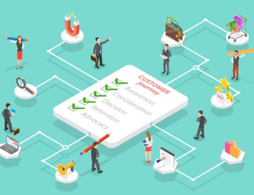
From Clicks to Customers: The Psychology Behind High-Performing CTAs
Most Call-to-Actions (CTAs) are as inspiring as soggy toast. You’ve seen them—“Submit,” “Learn More,” “Click Here.” Exciting, right? Nope.
From Clicks to Customers: The Psychology Behind High-Performing CTAs
Most Call-to-Actions (CTAs) are as inspiring as soggy toast. You’ve seen them—“Submit,” “Learn More,” “Click Here.” Exciting, right? Nope.
hese weak-sauce CTAs are why your carefully crafted ad campaigns and landing pages are bleeding potential conversions.
A high-performing CTA isn’t just a button. It’s a psychological nudge. A whisper to the subconscious that says: go on, you know you want to click me. It’s behavioural science dressed in bold colours and clever copy. Get it right, and your audience will move from casual scrollers to loyal buyers without even realising why.
This is the psychology behind CTAs – and how to design them to actually convert clicks into customers.
Why CTAs Fail (and Why Yours Probably Sucks)
Before we dive into the good stuff, let’s dissect why so many CTAs are dead on arrival:
Too Generic: If your button could appear on any website and still “work,” it doesn’t. “Click Here” means nothing.
Too Demanding: Asking for too much too soon. People don’t want to “Sign Up for Your Newsletter” unless they know what’s in it for them.
Too Hidden: Tucked at the bottom of a page, in bland colours, or competing with twenty other distractions.
Too Corporate: CTAs written by committee sound like CTAs written by robots.
Translation: the CTA is often an afterthought. And that’s like building a fancy restaurant and forgetting the front door.
The Psychology of a Click
Humans don’t click because of logic. They click because of psychology triggers. Here are the big ones:
1. Clarity Reduces Anxiety
The brain is wired to avoid risk. If your CTA is vague (“Submit”), users hesitate. If it’s crystal clear (“Get My Free Guide”), the risk feels lower.
2. Urgency Forces Decisions
Fear of missing out (FOMO) is powerful. Adding urgency (“Claim My Spot Today”) pushes the brain to act now instead of later.
3. Ownership Bias Creates Desire
Using words like “My” instead of “Your” makes people feel like they already own the reward. (“Start My Free Trial” converts higher than “Start Your Free Trial.”)
4. Contrast Guides Attention
The subconscious loves shortcuts. A bright, bold button surrounded by whitespace screams this is where you click. If your CTA blends in, it’s invisible.
5. Social Proof Reduces Doubt
Humans follow the herd. A line like “Join 12,000 Essex locals already saving with us” right above a CTA boosts trust instantly.
Copy That Converts: How Words Change Behaviour
CTA copy is where brands often phone it in. But words are where the magic happens.
Weak CTA: “Sign Up”
Stronger CTA: “Get Weekly Tips That Grow Your Business”
Weak CTA: “Buy Now”
Stronger CTA: “Make Tonight’s Dinner Stress-Free”
Weak CTA: “Download”
Stronger CTA: “Show Me How to Rank #1 on Google”
Pro tip: Always answer the user’s hidden question: What’s in it for me?
Design Matters (More Than You Think)
Your CTA could have killer copy and still flop if it looks like wallpaper.
Colour: No, orange isn’t always the “conversion colour.” The best colour is the one that stands out against your brand palette. Contrast is king.
Size: Big enough to see, small enough not to scream desperation.
Whitespace: Surround your CTA with breathing room so it pops.
Shape: Rounded edges are friendlier. Square edges feel serious. Test both.
Placement: Above the fold gets attention, but repeating CTAs throughout the page catches scanners who need more convincing.
Think of your CTA like a spotlight on stage—it needs focus, space, and confidence.
CTAs in the Wild: What Works
Let’s look at real-world examples of CTA psychology done right:
Spotify: “Get 3 Months Free” — clear benefit, no risk, easy ownership.
Airbnb: “Become a Host” — identity-driven, aspirational, simple.
HelloFresh: “Get Started” paired with “Over 1 Billion Meals Served” — action + social proof combo.
Now compare those with “Submit.” Doesn’t even feel like the same planet.
Micro-CTAs: The Unsung Heroes
Not every CTA has to be a big shiny button. Micro-CTAs are little nudges throughout the funnel:
Blog post end: “Liked this tip? Get the full playbook here.”
Pop-ups: “Yes, I want better rankings” vs. “No, I like staying invisible.”
Forms: “Show Me My Results” instead of “Submit.”
These subtle tweaks reduce friction and make clicking feel natural.
Testing: Stop Guessing, Start Knowing
Here’s the golden rule: you are not your audience. What you think looks good may tank conversions. That’s why testing is everything.
A/B Test Copy: “Start My Free Trial” vs. “Try It Free for 14 Days.”
A/B Test Colours: Button red vs. button blue.
Test Placement: Above the fold vs. mid-page.
Track click-through rates, bounce rates, and final conversions. Sometimes the ugliest button wins.
Advanced CTA Psychology Hacks
Want to really push it? Try these sneaky-smart techniques:
Loss Aversion: “Don’t Miss Out on £100 of Free Credit.”
Curiosity Gap: “See What’s Inside.”
Two-Step CTAs: Instead of one big form, start with a low-commitment CTA like “Check Availability.” Once they click, the commitment escalates naturally.
CTAs Across Platforms
Landing Pages: One clear CTA per page. Don’t overwhelm with choices.
Emails: Keep CTAs short, sharp, and singular. (One email, one goal.)
Social Media: Pair CTA with urgency: “Tap to Claim Your Free Spot Now.”
Ads: CTAs should align with the ad promise. If your ad says “Free Demo,” the CTA better not say “Buy Now.”
CTA Mistakes That Murder Conversions
Burying CTAs below the fold and never repeating them.
Overloading Pages with ten different CTAs competing.
Vague Copy that doesn’t connect emotionally.
Inconsistent Promises — your ad CTA and landing page CTA must align.
Ignoring Mobile UX — if your button is too small for thumbs, you’ve lost half your market.
From Clicks to Customers: The Real Point
A CTA isn’t just about the click – it’s about the conversion journey. It should feel like a natural next step, not a leap of faith. When you combine clarity, urgency, emotional resonance, and design psychology, you turn CTAs from limp afterthoughts into profit-driving machines.
The truth? CTAs are the closest thing you’ll get to mind control in marketing. Respect them, design them with intent, and watch your “Submit” button transform into a sales magnet.
Get in touch with us today to switch up your website and optimise for maximum conversions!