The Role of Colour Psychology in Web Design (And Why It Matters)
The Role of Colour Psychology in Web Design (And Why It Matters)
So if you’re tired of wondering why your “beautiful” site isn’t converting, spoiler: it might be your colours. Let’s dive into colour psychology, break down how it influences user behaviour, and learn to harness its power for a web design that doesn’t just look good—but performs like a rockstar.
The Role of Colour Psychology in Web Design (And Why It Matters)
The Role of Colour Psychology in Web Design (And Why It Matters)
So if you’re tired of wondering why your “beautiful” site isn’t converting, spoiler: it might be your colours. Let’s dive into colour psychology, break down how it influences user behaviour, and learn to harness its power for a web design that doesn’t just look good—but performs like a rockstar.
Ever walked into a room that made you instantly relax, or instantly want to bolt out the door? That’s colour psychology at play, my friend. The same principles apply to your website design. A simple tweak from red to green might be the difference between a user slamming the back button and clicking “Buy Now.” Yet, too many businesses pick their site’s colour scheme like they’re picking random socks in the dark.
What Is Colour Psychology, Anyway?
Colour psychology is the study of how colours impact our mood, feelings, and even decisions. Marketers have been using it for ages—think McDonald’s iconic red and yellow or Coca-Cola’s fiery branding. These hues weren’t chosen on a whim. They evoke hunger, energy, and excitement, all of which prompt you to stuff your face with fries or reach for a Coke.
Why It Matters in Web Design
Your website is your digital storefront. If visitors feel stressed, confused, or underwhelmed by the colours on your site, they’re gone faster than you can say, “404 error.” Colour choices can directly influence:
- First Impressions: Users form opinions within 50 milliseconds of seeing your site.
- Emotional Resonance: Colours can soothe, excite, or aggravate.
- Brand Recognition: Consistent colour usage can increase brand recognition by up to 80%.
Colour Psychology Basics: Breaking Down the Spectrum
Let’s talk about the main colour families and their usual psychological impacts. Caveat: People are individuals, so these aren’t one-size-fits-all—but they’re good general guidelines.
- Red: Passion, urgency, excitement. Also associated with warnings or sales.
- Blue: Trust, calm, professionalism. Often used by banks and tech companies.
- Green: Nature, growth, health. Common for eco-friendly brands and financial sectors (money, anyone?).
- Yellow: Optimism, energy, caution. Overdoing it can feel cheap or hectic.
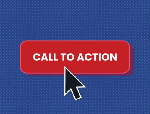
- Orange: Playful, creative, sometimes aggressive. Good for call-to-action buttons.
- Purple: Luxury, creativity, royalty. Be careful or it can feel too mystical.
- Black/White: Black can exude power or sleekness, while white often conveys simplicity or cleanliness.
Why Your Colour Choices Might Be Tanking Conversions
1. You’re Confusing the Eye
Too many colours = chaos. If your site looks like a rainbow threw up on it, users can’t focus. Instead of exploring your products, they’re mentally checking out.
2. You Lack Contrast
If your text and background colours are too similar, readability tanks. If a user can’t read your content without squinting, they’ll bail.
3. You’re Using the Wrong “Vibe”
Trying to sell high-end jewelry with bright neon pink might send the message that you’re cheap or teen-targeted. Colour must match brand personality.
4. Your CTAs Don’t Stand Out
You used a CTA button that blends in with the rest of your colour scheme? That’s the digital equivalent of a hidden exit sign—nobody’s gonna click.
Tying Colour to Brand and Audience
If your brand is edgy and bold, black and red might be your power combo. If you’re a skincare brand targeting a soothing, natural vibe, earthy tones or calming blues/greens are your jam. The key is to research your audience’s preferences and align with your brand’s core message:
- Young, fun audience? Go bright, playful colours.
- High-end, luxury vibe? Dark tones or soft gold accents might convey exclusivity.
- Healthcare or wellness? Stick to calming blues and greens for a trust-based approach.
Practical Colour Psychology Tips
1. Pick a Dominant Colour Aligned with Your Brand
This is your anchor. If your brand is known for trust and stability, maybe that’s blue. Everything else revolves around it.
2. Choose 1–2 Accent Colours
Too many accents = visual vomit. A couple of complementary or contrasting colours can make your design pop without overwhelming.
3. Use Contrast for Clarity
Your CTAs should stand out. If your site is mostly pastel, try a bold accent colour for your CTA button—something that screams “CLICK ME!” not “Ignore me.”
4. Save Bright Colours for Action Elements
Slap bright orange or red on your CTA, not your entire background. This draws attention exactly where you want it.
5. Test, Test, Test
A/B test colour variations to see which combos lead to more clicks, sign-ups, or sales. Don’t rely solely on colour theory—use real-world data.
Myth-Busting: Colour Psychology Edition
Myth #1: “Colour Preferences Are Universal”
Reality: Culture, personal experience, and context matter. One person sees red as passion; another sees it as danger. Know your audience.
Myth #2: “A Single Colour Will Solve All My Problems”
Reality: Colour is part of the puzzle, not a silver bullet. Your typography, layout, and copy matter just as much.
Myth #3: “All CTA Buttons Must Be Red/Orange”
Reality: Just because orange buttons worked for Amazon doesn’t mean it’s gospel. Your design and brand palette matter more.
Jargon-Busting: Hues, Tones, and Hex Codes
- Hue: The base colour (like red, blue, yellow).
- Saturation: The intensity or vibrancy. More saturation = more “pop.”
- Value (Brightness): How light or dark a colour is.
- Hex Code: The six-digit code (like #FF5733) that defines a colour for the web.
Why This Matters: Understanding these basics prevents you from banging your head against the screen when your designer asks for a “less saturated navy.”
FAQs: Burning Colour Psychology Questions
Q1: Should I only use colours that are “tried and tested”?
Nope. It’s good to see what works in your industry, but don’t be afraid to break the mold—just be intentional. Stand out, but don’t assault your user’s eyeballs.
Q2: How many colours is too many?
A general rule is 3–4 max: a main brand colour, a background, a text colour, and an accent. Anything more can get messy.
Q3: Do colour theories conflict across cultures?
Yes. White is purity in the West, but can signify mourning in some Eastern cultures. If you’re global, do some cultural research.
Q4: Can colour fix a bad product or service?
Let’s be real: No. Colour can help messaging, but if your product stinks, it won’t magically become gold.
Conclusion: Put Some Colour Theory Into Action
Colour psychology isn’t a fluffy concept. It’s a tangible tool that can make or break the way users perceive your brand, navigate your site, and ultimately convert. Whether you’re going for bold and brash or subtle and sophisticated, make sure your design choices are rooted in real insights, not random guesses.
Don’t forget to test your colour schemes on real visitors. Check your analytics to see if bounce rates drop or conversions spike after that design tweak. And if something’s off, don’t be scared to pivot quickly. A/B testing is your best friend in the quest for the perfect hue.
Take colour seriously, blend it into your overall strategy, and you’ll see why it matters for user experience, brand recall, and (most importantly) your bottom line. So go on—paint your website into a masterpiece that doesn’t just look great, but converts like a boss. Give us a shout to chew the fat on this and get our steer on your ideas or current branding!